Digital Academy Blog

Colour in Digitalprinting

Spoonflower’s digital print process


Spoonflower’s digital print process allows designers to use as many colors as they want in their designs and create millions of unique colors. But since every computer monitor is different, your printed fabric may not print exactly as it appears on screen. While we always try to ensure that colors are as bright and accurate as possible, there are a few ways to make sure you get the colors you want.

Ordering From The Marketplace?

If color is important to you, it’s always (always!) a good idea to order a test swatch before purchasing yardage. How the design looks on the screen can be a good preview, but in the end, the only way to judge whether your colors will look as you expect them to when printed is by holding the printed sample in your hands. Most people are happy with their Spoonflower orders, but testing first is a really good idea, and it’s absolutely essential if getting the colors just right is intrinsic to your goal.


Creating Your Own Design?

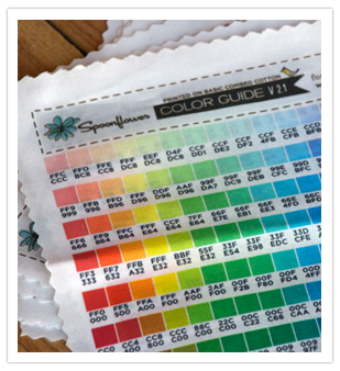
The easiest way to get the colors you want is to create your design using our color map or guide. We recommend working in the sRGB color space both because it produces beautiful color prints and because the Spoonflower Color Guide and Map (in sRGB color) will be more useful to you as color management tools. You can purchase the color map or color guide here: Design Tools.

The color guide is an 8" x 8" swatch of printed Basic Combed Cotton with 171 color chips and their hex codes. What is a hex code? They all render on fabric very similar to how they look on your screen.

The Color Map prints onto one full yard of any of our fabrics and on 4ft of wallpaper. This color map is comprised of over 1400 color chips and their hex codes.

You can use the guide or map with almost any image editing programs. Create your design in sRGB and use the hex code for the color you want in your design:

If you are a Photoshop or Illustrator user, you can also download the Adobe Swatch Exchange file for our Color Map.

All designs are automatically converted to sRGB for printing and this conversion will result in some color difference if you use an alternate color space for creating your design. You can still use whatever color space you are most comfortable with, but make sure you stick with it on all of your designs from start to finish, and test (test, test). If you do use another color space, the color selected from the color guide or map will not print accurately.

See also: Saving Image Files as sRGB

General Tips For Color On Fabric

  • A design displayed on your computer and the printed version will not look exactly the same. In addition, the printed version on your home printer will not look the same as the Spoonflower print. The inks, material, and technology are different.

  • Designs printed on wallpaper, gift wrap and polyester fabrics tend to print more vividly than on natural fiber fabrics.

  • You can expect to see slightly different results depending on the weight of the fabric you choose.

  • Dark colors that are similar to each other may blend together when printed without enough contrast. A perfect example is black stripes on a dark grey background.

  • Highly saturated dark colors printed in large, solid areas don't have the visual impact they do on your monitor because inks tend to render saturated colors a bit different than you might expect.

  • Our inks on fabrics with natural fibers aren’t capable of rendering a true, rich, saturated black, and this limitation will probably be noticeable in designs that use large fields of black. To avoid your black looking noticeably dark charcoal gray, it’s best to use black in small amounts, with a lot of lighter colors.

  • We only print on white fabric (there are no white inks), so there is no way to start with dark fabric and create a lighter colored design on top of it.

  • Fine details print best when they are high contrast. The resolution possible with digital printing on textiles is actually better than screen-printed textiles, so you can do amazing work with details in your designs as long as the contrast is good.

  • Dark colors work well as foreground and detail elements although again, they may print somewhat lighter than they look on your monitor.

  • We do not have metallic ink, so you will need to simulate that look with your colors.


color-map.jpg

Spoonflower, how to...

SPOONFLOWER -ALL ABOUT COLOUR
How Can I Make Sure My Design is the Colour I Want?


Spoonflower colour map
Map

ORDER TEXTILE SAMPLES AND COLOUR CARD
http://www.spoonflower.com/design_tools

Fabric
https://www.spoonflower.com/spoonflower_fabrics/#Chiffon

more on colour and digital textile printing
https://support.spoonflower.com/hc/en-us/articles/204444620-How-can-I-make-sure-my-design-is-the-color-I-want-

WHAT ARE COLLECTIONS AND HOW DO THEY WORK?
https://support.spoonflower.com/hc/en-us/articles/204444550-What-are-Collections-and-how-do-they-work-

HOW CAN I GET SWATCHES AT A REDUCED PRICE?
https://support.spoonflower.com/hc/en-us/articles/204444540

How to Turn Art into Fabric
https://blog.spoonflower.com/2015/08/how-to-turn-kids-art-into-fabric/


Spoonflower PRO
Pro is a premium service for small business owners.

Benefits Include:
Free standard shipping worldwide

  • Guaranteed 1-week turnaround time

  • Half-price expedited shipping

  • Unlimited half-price swatches & swatch samplers

  • Dedicated help team

  • Exclusive access to insider news

läs mer om :

OTHER PRINTING COMPANIES / tryckföretag

What you should know about digital textile inks

Textiles are one of the fastest growing sectors of digital printing. The applications are numerous, with the most common including apparel, soft furnishing, soft signage and flags. 

Also numerous is the choice of inks for inkjet printers. It’s not always clear what the difference is between some similarly-named fluids. Some have been adapted from earlier analogue printing processes, while others have only ever been available for inkjets.

The ‘hand feel’ of a textile is important, especially for clothing or garments (which we’re calling apparel here). This means the way the material flexes and drapes.

Dye inks enter the fibres of the textile and typically don’t alter the feel, though there may be an initial ink-acceptance coating that has to be washed out after printing. Inks that have a carrier that stays on the textile often make it stiffer and alter its feel.

Here we provide a brief introduction to the main types of inkjet textile inks, their characteristics and any pre- and post-processing needed to fix them. Some inks can also be used with leather, which isn’t a textile but is commonly used in apparel and furnishings.

We’ve not gone into detail with pre-treatments; this may be performed by the textile supplier, which will sell pre-treated materials for particular processes. Larger scale industrial printers may have the facilities to treat their own textiles.

Our thanks in particular to Steve Woodall, national sales manager for textiles and apparel at Hybrid Services, the UK distributor for Mimaki. He provided a lot of the practical information about these inks.

Note that dry toner printers can produce heat transfers suitable for textiles, but we’ll look at them another time.

Dye sublimation/disperse dye Textiles: polyester and polyester-cotton mix Pre-treatment: yes Process: inkjet onto paper or direct to textile rolls Post-process: dry heat/pressure transfer or dry heat activation and washing (direct printing) Application: apparel, soft furnishings, soft signage, flags, hard surfaces Dye sublimation is a water-based ink that works with a wide variety of inkjet printers. Most are adapted from standard eco-sol models, though a few have been purpose-built.

This ink is very widely used for textiles because it is easy to work with and only requires heat and a little pressure as a post-process.

It produces bright colours, but the limitation is that it only works with polyesters. Polyester-natural fibre mixes can be used, but the less polyester the fewer the binding points for the dye, so the image is duller and wash resistance suffers.

The ink can be used either to print onto a transfer paper or directly to the textile. Some manufacturers call it ‘disperse dye,’ usually when referring to direct printing. In some cases, the same ink is used for paper as direct to the textile (which needs a pre-treatment to reduce spread and wicking into the fibres before it is heat-fixed).


Source: https://www.fespa.com/item/5467-what-you-s...